


CASE STUDY
Enlighten Dispensary

PROJECT OVERVIEW
WHO?
Located in Marlton, NJ, Enlighten Dispensary presents itself as “more than a dispensary — a vibe.”
They offer a curated selection of cannabis products: flower, pre-rolls, edibles, concentrates, vaporizers, tinctures — all sourced from trusted growers and manufacturers committed to quality, purity, potency, and flavor.
Enlighten caters to adult-use customers (21+), with strong emphasis on lifestyle and aesthetic: their goal is to deliver cannabis with style, convenience (including online menu + in-store pickup), and a brand ambiance that matches their curated product lineup.
As a dispensary with frequent deals and discounts — first-time customer discounts, veteran / first responder discounts, medical-card discounts, birthday promos, and a tiered loyalty/rewards program — Enlighten’s visual and communication demands are high.
WHAT?
Enlighten came to MOST seeking a unified, modern visual system to support their ambitious retail vision: an adult-use dispensary offering premium cannabis products, recurring deals and discounts, a robust rewards program, and a polished shopping + brand experience. Over four months, MOST transformed their static, inconsistent visuals into a dynamic, cohesive, and scalable brand system — enabling Enlighten to deliver clear messaging, vivid promotions, and a premium vibe both online and in-store.

THE CHALLENGE
Despite having a strong concept and product offering, Enlighten faced several communication and brand challenges:
- Their website, in-store screens, and marketing materials lacked a unified visual identity — leading to inconsistent presentation of deals, promotions, and brand tone.
- Their existing graphics and promotional content were typically static, which did not align with expectations in modern cannabis retail where motion, clarity, and frequent updates are the norm.
- Every time pricing changed, deals rotated, or new products arrived, creating new promo assets was time-consuming and inconsistent.
- Their email marketing was functional but lacked interactivity and engagement potential — particularly for a customer base used to digital convenience (e.g. online ordering, in-store pickup, browsing full menus, joining a rewards program).
- With Enlighten’s wide product variety (flower, edibles, concentrates, vapes, tinctures) plus a robust loyalty program and discount structure, they needed a flexible asset system capable of scaling — without sacrificing brand cohesion.
OBJECTIVES AND STRATEGY
OBJECTIVES
- Establish a unified visual identity and brand standard that aligns with Enlighten’s vibe: premium, stylish, and approachable
- Build a modular promotional asset system: able to reflect frequent deal changes, varying price points, and new product drops quickly and consistently
- Introduce motion graphics and dynamic content to align with modern retail and user expectations — especially for in-store screens, web slides, and social/online promotion
- Redesign email communications to be interactive and engaging, supporting online ordering, promotions, and customer loyalty / rewards program enrollment
- Improve readability, clarity, and conversion potential of in-store and web content: ensure deals, discounts, and product features are easy to digest and act on (e.g. click-through to menu or pickup)
STRATEGY
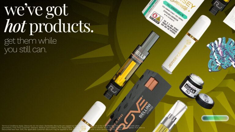
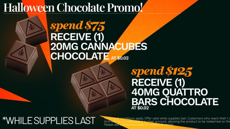
Modular & Scalable Promo Template System
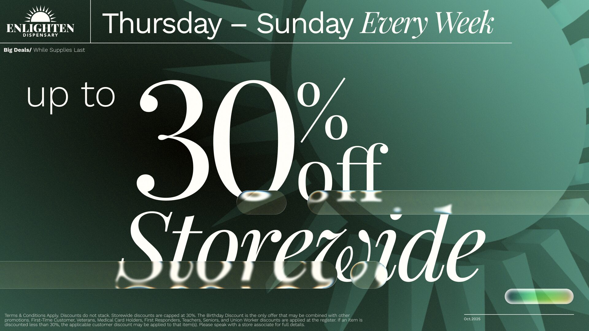
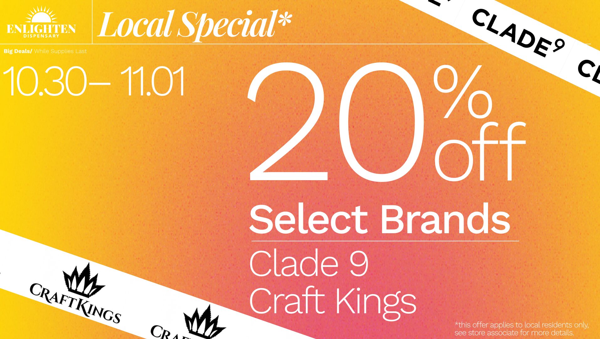
Recognizing that Enlighten’s deals and inventory change often — especially as they offer discounts like first-time customer 30% off, veteran/first responder discounts, medical-card discounts, birthday promos, and a tiered loyalty rewards program.
We created a flexible system of graphic templates for:
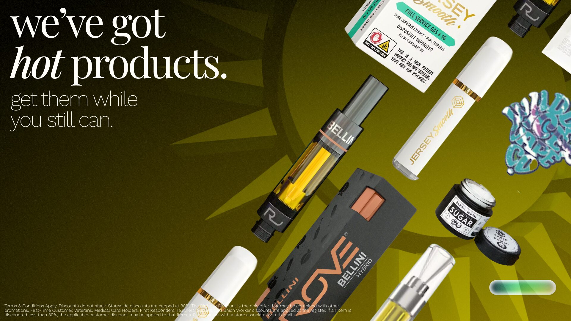
- Product drops / new brands & product arrivals (e.g. “New Products” page)
- Regular discounts and deals (with clearly marked discount badges or price reductions)
- Loyalty / rewards promotions — aligning with their rewards program tiers (Bronze Leaf, Silver Bud, etc.)
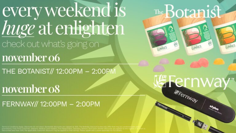
- Events or specials (e.g. holiday promos, special inside-store banners) — assets that can be quickly updated when inventory or promotions rotate
This modular approach drastically reduced time spent on asset creation — no more rebuilding from scratch whenever pricing or deals changed.
VISUALS

CREATIVE CONCEPT
Designing The Experience

EMAIL MARKETING

Preliminary Sketching
Sketches give structure and intent, but final designs require polish, clarity, and brand alignment. Without refining hierarchy, whitespace, and CTA emphasis, a sketch that “works on paper” may underperform as a live asset. This aligns with best practices for layout, readability, and usability.
For clients like Enlighten — with evolving promos, frequent updates, product changes — a modular, flexible template system makes the difference between a one-time design and a scalable, repeatable marketing toolkit.
Ensuring brand consistency from the start helps avoid costly redesigns. Even sketches should reference brand tone / mood so that the final design feels cohesive and intentional, not slapped-together.
Clear CTA and user flow prioritize functionality over aesthetics alone — which is essential for conversion-driven design (email click-through, in-store impulse, web-to-order).
Final Product
We rebuilt Enlighten’s email templates to be fully clickable and responsive, aligning with their website brand style. The new email layouts included modular blocks for new-product announcements, deals/discounts, rewards-program highlights, and easy call-to-actions (“Shop Now”, “View Deals”, “Join Rewards Program”).
This supported their online ordering + in-store pickup flow (which they support via their website) and ensured customers staying subscribed could be re-engaged with up-to-date offers and visuals.
IN-STORE GRAPHICS
Identifying the Needs of the Space
Early observations of Enlighten’s retail floor revealed a core challenge: the existing signage wasn’t fully leveraging the physical environment to guide customers toward deals, product categories, or brand messaging. Promotions existed, but the hierarchy was unclear, making it difficult for shoppers to distinguish new products from ongoing discounts or brand campaigns.
The in-store graphics needed to:
Reinforce Enlighten’s updated brand aesthetic consistently across locations
Improve messaging clarity through typography, color, and modular composition
Create visual anchors that customers could spot from a distance
Translate complex deals into digestible, single-glance information
Seamlessly integrate with digital components, ensuring brand continuity from screen to store
Design Direction & Refinement
During the development phase, our initial concepts experimented with bold typography, layered graphical elements, and color systems derived from Enlighten’s refreshed brand palette. These early explorations prioritized attention-grabbing visuals but revealed that legibility and message hierarchy needed to be more streamlined for a retail environment where customers make decisions in seconds.
From this, our direction evolved toward:
Cleaner typographic stacks that separated deal details from product names
Consistent iconography to reduce cognitive load and speed up comprehension
Color-coding structures that categorized product types and promotional tiers
High-contrast layouts optimized for distance readability and varied lighting conditions
The final in-store graphic system became a modular toolkit: adaptable for new promos, scalable across wall formats, product tables, and window applications, and instantly recognizable as part of Enlighten’s visual identity.
Outcome
The resulting suite of in-store graphics transformed Enlighten’s physical shopping experience into a cohesive, branded ecosystem. Customers could now intuitively follow visual cues, understand promotions quickly, and engage with the store’s offerings more confidently — a noticeable improvement from the fragmented system that existed before.


EXECUTION
Results That Moved The Needle
Deliverables
Over the course of the engagement, MOST delivered:
- A fully defined visual-identity guideline for Enlighten’s digital and print-ready use (colors, typography, motion style, layout patterns)
- A modular template toolkit for promotions, deals, and product features (static + motion graphic versions)
- Redesigned email templates — interactive, visually consistent, aligned with brand identity and website UX
- In-store motion graphics and slide decks for digital screen deployment (promotions, deals, new product drops)
- Web slide-designs for desktop — for pages such as “New Products,” “Deals & Discounts,” product menu, and promotional banners
An asset update workflow: enabling quick edits and redeployments when promotions, deals, or pricing changes occur — eliminating long lead times for each change
Results That Moved the Needle
Post-overhaul, Enlighten enjoyed:
- A consistent, premium brand image across in-store, email, and online — matching their positioning as a “vibe”-centered dispensary offering high-quality cannabis products and a curated experience.
- Faster asset creation and deployment: modular templates cut production time dramatically whenever new products or deals were launched.
- Improved customer engagement and clarity: motion-based visuals and slide layouts helped customers quickly see deals, new arrivals, and rewards — likely increasing interaction with promotions and boosting conversion from online menu / in-store pickup.
- Better alignment between marketing channels (email, web, in-store screens) — ensuring consistent messaging and visual identity, reducing customer confusion, and strengthening brand recall.
Scalable infrastructure: As Enlighten grows its product lineup, runs more deals, or updates pricing — they now have a visual & content system that scales without losing brand cohesion or quality.
