Packaging Design Case Study
Learn how we created a packaging line for Good Earth Organics, a manufacturer of premium, certified organic potting soils and soil nutrients.Project Overview
Since 2008, Good Earth Organics has been the trusted organic choice in the Emerald Triangle for professional growers, home growers, and gardeners seeking large yields and pure plants. GEO helps its customers grow bountiful, healthy, toxin-free plants, whether growing outdoor, indoor, or hydroponically.
GEO brought us on to develop a fresh assortment of packaging for their organic fertilizers and liquid plant food products. Our goal was to create a beautiful array of packaging that communicates their product lines' benefits.
The Product
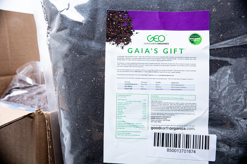
GEO's line of organic amendments, fertilizers & nutrients is available online and in-store. We needed to create packaging that would stand out not only on an e-commerce site but also on the shelf in a retail store. Plant nutrients require several things to be included on the packaging to meet various industry regulations that we also needed to consider.
Pictured above are examples of GEO's old packaging before we started the redesign process.
The Approach and Process
To start the packaging design process, we sat down with GEO's team for an in-depth strategy session to get a sense of where they wanted to take their packaging the brand's style. Our meetings uncovered that they desired to shift away from their existing corporate look while not going too far in the other direction. It became clear that we had to bridge the gap between professional and illustrative.
After working with their team to understand the goals and direction of the new packaging, we started by creating an array of thumbnail sketches with different layouts and imagery. From here, we created a set of three simple digital illustrations to test and share with GEO.
Upon presenting the sketches to the client, we narrowed our options to the one concept they liked best. The next step was to add more detail to the simplistic rendering, so we picked out pieces of imagery that fit the use of each product line to create more developed illustrations.
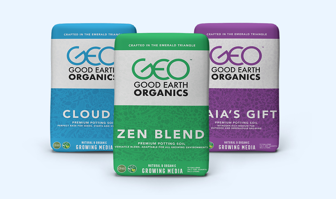
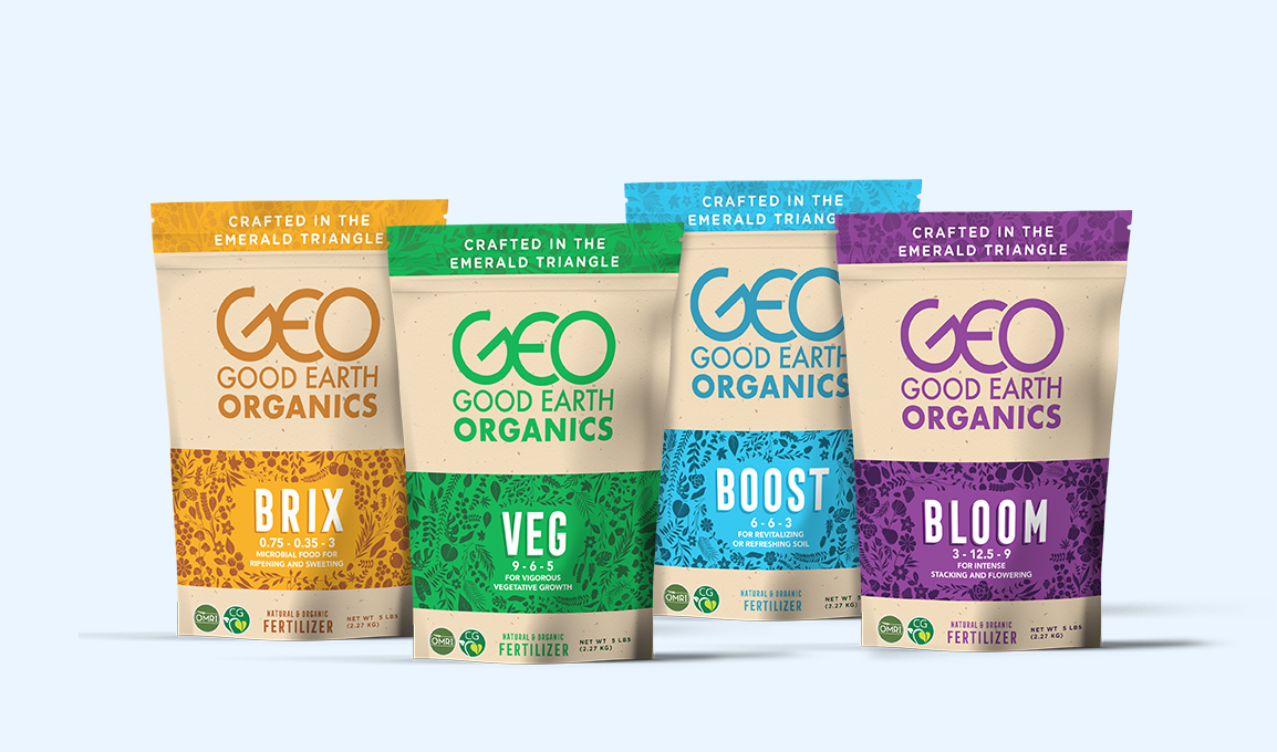
We have a more advanced version of the packaging for each product line at this point in the process. It's time to start filling things in and drafting the actual label and package designs, combining the framework we created before, color palettes, and illustrations. After some back and forth between GEO and us to adjust small details such as font sizes and the placement of technical information, we came to a final design for each product, pictured below.
Packaging design is a collaborative process that takes sufficient time and communication to get right. After working closely with GEO's team, we refined our designs to prepare the files for print. Having completed many packaging products in the cannabis space, we can help our clients source materials and connect them with various packaging suppliers.
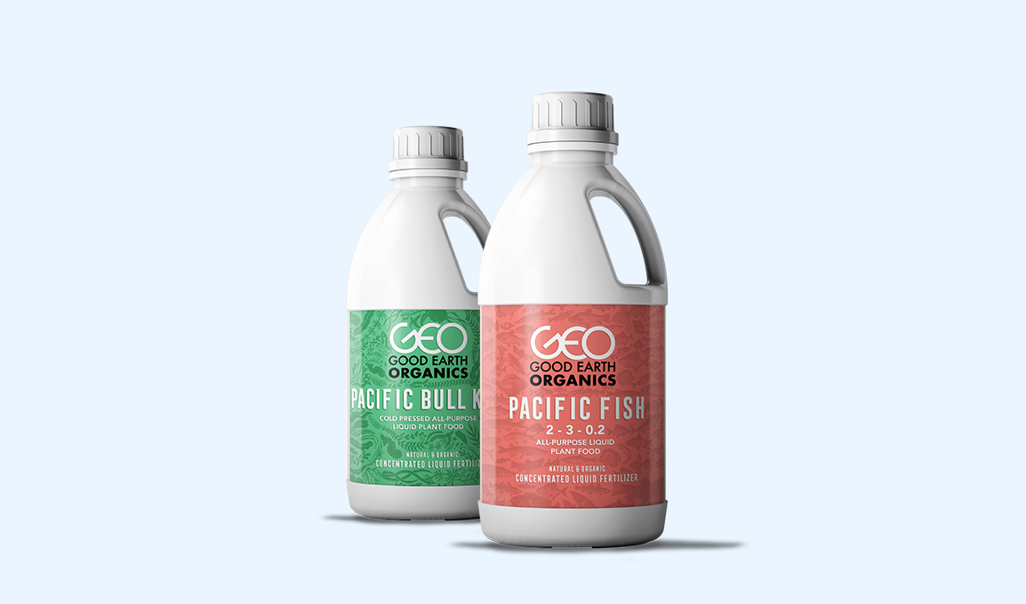
The Result
Fertilizer Line
Liquid Plant Food Line
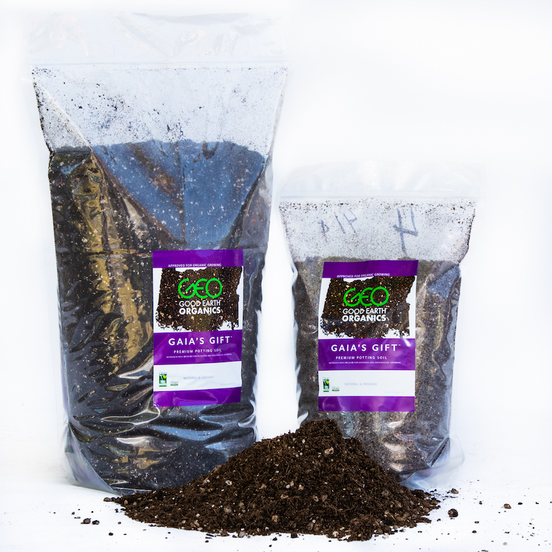
Main Soil Package Line